Saturday, 30 August 2014

Note: Light: directed, reflected & diffused. (WK 6)

Reflectors- I found using reflectors quite fun and really useful. It was a way to introduce light into the photograph without using a flash or seperate light source. Reflectos can be used to reflect, direct or diffuse the light.

ISO 100-F/8-1/80
This studio photograph, we introduced a white reflector to get more light on the left side of his face. The direct light which is to the viewers right, made the contrast between the left and right side quite strong. In introducing the reflector, more light was brought into the left side of his face and the contrast was toned down quite a lot. The light is a lot more even across his face now because of the use of the reflector.

Where the white reflector brought in the same colour light that was already being projected, other reflectors can be used to bring in different kinds of light tones. A gold reflector will bring in warmth to an image, a silver reflector brings in a cool reflective light that is quite bright. The black brings in a toned down light and if you hold the opaque reflector up in front of a studio light, it can be used to subdue the light and make it softer, similar to using a soft box. It can be used in the same way to block the sun and diffuse the light in a photograph.

Friday, 29 August 2014

Research: Miwa Yanagi (DT WK 6)

Miwa Yanagi, master of the weird and the wonderful, her images made using photographs and carefully crafted Photoshop techniques are both odd and somewhat disturbingly beautiful at the same time. The photo below is one of my favourites, the playful innocence of the photograph as well as the anticipation of danger, these two aspects are balanced, the viewer doesn't know whether to smile at the sight of a person sitting in snow indoors or feel a sense of fear at the person playing with fire. It was hard finding anything on her processes, but for this one I assume half studio, half outdoors and part post production. It's really hard to say what the artist has done for this image. It is something that really interest me, I do love her images and the way she pulls them off flawlessly.
The Little Match Girl 2005 Gelatin silver print

Thursday, 28 August 2014

Working with Models!

-Know your idea/concept.
-Communication is key. Ask them to move around, smile, change position, etc.
-Allow them to make suggestions.
-Set lighting up before they arrive if possible, you'll need a second person to help out.
-Collect images/clippings to inspire you. (I use pinterest.)
-Have images available for your model, an image of how you want the photograph to ultimately look like.
-Make them feel comfortable.
-Meet them before hand, it'll be easier in the long run to get to know them a little bit. Find out what they/you want from the shoot and possibly swap some ideas.
-Be respectful and aware of their basic needs, i.e breaks, food, drink...

Wednesday, 27 August 2014

I know this is off topic, but....

500 Years of Female Portraiture in 3 Minutes.

I stumbled across the above link while doing a little research and thought it was pretty amazing. It isn't photography, but it could be used for pose when it comes to the face and facial features.

Research: Annie Leibovitz. (WK 6)

Annie Leibovitz is well known for photographing celebrities, but they aren't embarrassing or surprising shots as you would see with paparazzi, they're photographs with willing participants. The photographs themselves are beautiful. This example of her studio photographs is soft, with lighting that accentuates certain parts of the image. There is obvious positive and negative space in this image, with a shallow depth of field as well. There is no background to this image, only the figure in the foreground. The pose of the figure sets her apart from the viewer, she's closed off and a little withdrawn, as if lost in her own thoughts. Unlike the last photographer I looked at, there is a fair amount of shadow and light in this image. The shadows highlight parts of the image, namely in the skin of the figure. Ideal lighting in this image would be, one soft one for the background, not so much that it looks completely white because we can still see a little texture to the background. As well as a light on the figure, or flash, something to bring out the highlights in her skin tone and detail in her face and hair, but doesn't make her look completely washed out.
Angelina Jolie, for Vogue, 2007.

Research: Juergen Teller. (WK 6)

"A Trip or a Voyage" Louis Vuitton Cruise 2015 collection.
It was hard finding images for this artist, but the one above I liked a lot. I found it on a fan made tumblr account dedicated to Juergen Teller. The photograph to the right was was taken in a studio, this is easily seen by the white background. The photographer would've had at least two lights for this photograph, one for the background and one or more on her. Lighting the background as the photographer has done, sets the background and figure apart from each other. There is more depth even in the negative space around her. The light on the figure highlights her hair and face, there is very little shadow in the image at all and almost no negative space on the figure herself. The light on the figure has made sure there is detail in the space, with a lot of white in the image, the light has allowed for detail to be shown in the folds of her shirt as well.

Monday, 25 August 2014

Photoshop: Photomerge. (WK 6)


Photomerge is an interesting tool on photoshop, the above images are made out of multiple photographs all combined together. The top two I used layer masks to colour in some of the figures, thus merging the two (or three) photos and the figures within them. The last photograph is made up of three photographs, each photograph with a slightly different angle, the camera having been moved with an overlapping scene. In each frame the figures moved, creating the effect of multiple figures in the photograph. Photomerge is useful in the fact that there is no visible line or colour change where the photos have been stitched together. Photoshop does well in gauging where the photographs should overlap and meet. I guess, using the layer masks and such it could be used in reverse, to take figures out of an image as well.

Metadata for the above images:
ISO 100
F/16
1/50

Experimentation:

 I adjusted the levels, hue and saturation and brightness of this image and think it looks a lot better than what it originally did after the photomerge. The colours, like the blue of the sky and green of the grass, are a lot brighter and I think that works better for this image. The sky looks like it's got more depth and there's more detail in the clouds. I prefer this image over the original. I just wish I could fix the fact that some of the figures don't have a shadow.

Note: Flash: Direct, reflected & diffused light metering. (WK 6)

Direct flash:
A direct flash is exactly that, directly on the subject. This photograph is probably not the best example as it is outside and the sun was quite bright, but for this purpose it's okay. A direct flash is a lot harsher than a diffused or bounced flash.


Bounce flash:
The bounce flash is pretty self explanatory, it's a flash that is bounced off of something, i.e a wall or in the case of this photo, a set of lockers. The card that is visible in this photograph is also another tool in which you can bounce a flash off of. A bounce flash is useful for softening the flash while still having quite a bright outcome. 


Diffused flash using half moon:
 In these two photographs, the difference in light is quite distinct. in the first the sunlight is harsh, but the second, the light; especially on her face, is quite a bit softer. For the second photograph I used the half moon diffuser, which kept light on her face, but made it a lot softer.


Under exposed background:


This is the before and after shot when I under exposed my background. First & Second.
ISO 200                   ISO 200
F/5.6                        F/10
1/80                         1/160
In the first photograph I used no flash, but in the second the flash highlighted the figure, bringing her out and away from the background. Using the flash added more depth to the photograph, creating shadows behind her. It changed the lighting in the hall a lot, going from the greenish light to a darker grey. These two photographs successfully show how flash can be used to under expose the background in a photograph. I personally feel that the second photograph was far more successful than the first, with more depth added to the image.


Over exposed background:
The background of this photo is only slightly over exposed. The white of the building and sky is the area that it the most over exposed in this photograph.
ISO 100
F/5.6
1/60


Flash and blur:
F/8.0-1.0-ISO 100
 Flash and blur is similar to the bulb function and motion blur. With motion blur however, the motion is mostly captured at it's start point. With Flash and blur, the flash goes off when you take your finger off of the trigger, so the more prominent part of the image is the end. That is probably the wort way to explain it, but as you can see in these two photographs, the people are most visible at the end of their movement, so the middle of the jump and the end of her pacing.
F/8.0-1.0-ISO 100

Sunday, 24 August 2014

Selections. (DT WK5)

After
Before
Before
For this exercise we focused on parts of the photographs taken. The photo to the left was originally a photograph with her eyes closed. Using a second photograph, I selected her eyes and merged it with this image. It took a bit of getting used to, using the clone tool as well as the burn tool, but I managed to get the skin tone around the eyes to look as if the image was taken as it is. It was a long process, but the result was better than I first expected it to be.

In the lower image to the right, the objective was to separate the figure and the background and then change the colour of said background. We were practicing using the magic wand tool/quick selection tool and for the most part, it did get the majority of the background, although there are patches right around the figure and in between the strands of her hair. If I had spent more time on this image-and I fully admit that I did not spend all that much time on it- I could have taken out all the yellow in the image, especially around her hair. It was a particularly difficult area, but with more time, I probably could have done a cleaner job.

The image to the left of this paragraph was relatively easy, using the lasso tool I selected an area of the image and changed the colour using hue and saturation. It was a simple task and relatively quick. I chose pink because of how well it goes with the yellow and how well it stands out in the image.

Note: Contrasting & Complimentary Colours. (WK 5)

ISO 100
F/8.0
1/100

ISO 100
F/8.0
1/100

ISO 100
F/8.0
1/100
Bright contrasting and complimentary colours:
ISO 100
F/8.0
1/100
The objective was to find contrasting and complimentary colours around Lovegrove crescent. I felt these four image showed the best of complimentary and contrasting colours. The yellow and pink work as well as the green and pink or the opposing green and reds. The combination of cool and warm colours, the brighter colours fighting for the viewers attention. The pink and green flower is probably my favourite image. The green leaf cuts through the pink. the pink trying to come forward in the image while the green of the leaf recedes more towards the back of the photograph.


 I personally like the non-cropped version of this image more, it feels more natural. This image looks a little squashed, but it does help to make the colours stand out a bit more and become the main focus of the image a little better. Before, it felt like the image was uncertain of what it was meant to be and the focus in general, but now it feels a little more focused on the colours of the two cars, which contrast beautifully.

Contrasting Colours and Light. (HW WK 5)

A photograph taken in early morning light with warm colours:
ISO 400
F/8.0
1/100
It's a little hard to see, but there's a ring on the lid that's a redish colour which is why I chose it. The warm colour was meant to contrast with the cool light, but instead looks washed out. Even though it wasn't as successful as I'd hoped it would, I still like this photo a lot.


The soft colours in these two photographs compliment each other quite well. The colours are designed to work together, something for a children's room. This is why the colours work well in complimenting each other.
 ISO 400
F/7.1
1/80

Take a photograph with complimentary colours:
The blue and pink (I couldn't find any red/violet) are colours that compliment each other quite well. The blue recedes while the slightly warmer, pink advances.
ISO 100
F/10
1/80


Take a photograph with contrasting colours in afternoon light:

It's a little hard to see, and maybe if I adjusted the exposure, but the little pods next to the flower are a green colour. Pink and green are colours that usually contrast quite well, the cooler green and the warmer/brighter pink. The afternoon light is quite harsh in this image as well, making the image slightly over exposed.


 Shoot a scene three times, using the correct white balance setting, and then using two incorrect white balance setting:
Daylight
Flash
Automatic White Balance
I took the same photograph four times with different white balances to look at the way the white balance could alter the light in the photo. For a few of them, it didn't seem to make a difference. For others it made a huge difference. The results are quite different, the flash and daylight settings were very similar with only a tint in one photograph making them different, but the tungsten setting made the most difference. As the light was a white fluorescent light, the tungsten setting cooled the whole image down making it blue. Had I used my usual room lighting, which is quite warm and yellow, the picture would have come out quite neutral rather than blue. This was an interesting experiment and showed the importance of using the correct white balance.
Tungsten


Saturday, 23 August 2014

Research: Rossella Vanon. (WK 5)

“The truth is the work of a photographer is much less technical than people probably imagine. There is no real rule in creating a fashion story, no rule in composition… Every photographer should have his own personal way of developing a story, of creating an image. It’s about observing and daring. And it’s always so personal and intimate.
70% of my work consists of imagining, creating and playing. You start from a technicality and you turn it around and you twist it and deform it, even, until you make it something unique. Until you make it yours.” – Rosella Vanon

Source:http://nw6creative.com/2013/01/28/there-is-no-real-rule-in-creating-a-fashion-story-rosella-vanon/
Light, it's a major aspect of Rossella Vanon's work. All different kinds of light, used in different ways. The light in the above photograph, seemingly natural is directed at the figure, bringing the attention of the viewer to the figure in the frame. The light is soft, highlighting parts of the figures face, bright enough that the viewer can see shapes and curves on her skin. Light helps accentuate parts of the photograph particularly in her face.

The studio light is directed at the model, seemingly from above, this allows the light to be trained on her face and shoulder rather than the rest of the image. I'm guessing a reflector was used to add some filler to the shadows that would've occurred on her face, primarily under her chin. The perks of this kind of lighting is it looks very natural, the (gold) reflector casts some warmth into her face making the image look as if it was taken outside.

Note: Colour, Metering mode & Focal length. (WK 5)

 Take a photograph of someone with their eyes closed and then with their eyes open:

The yellow background of these photographs really make the person stand out in the image. The dark colour of her hair makes a solid line between the background and the subject.


Take a low angle portrait of someone against the sky:

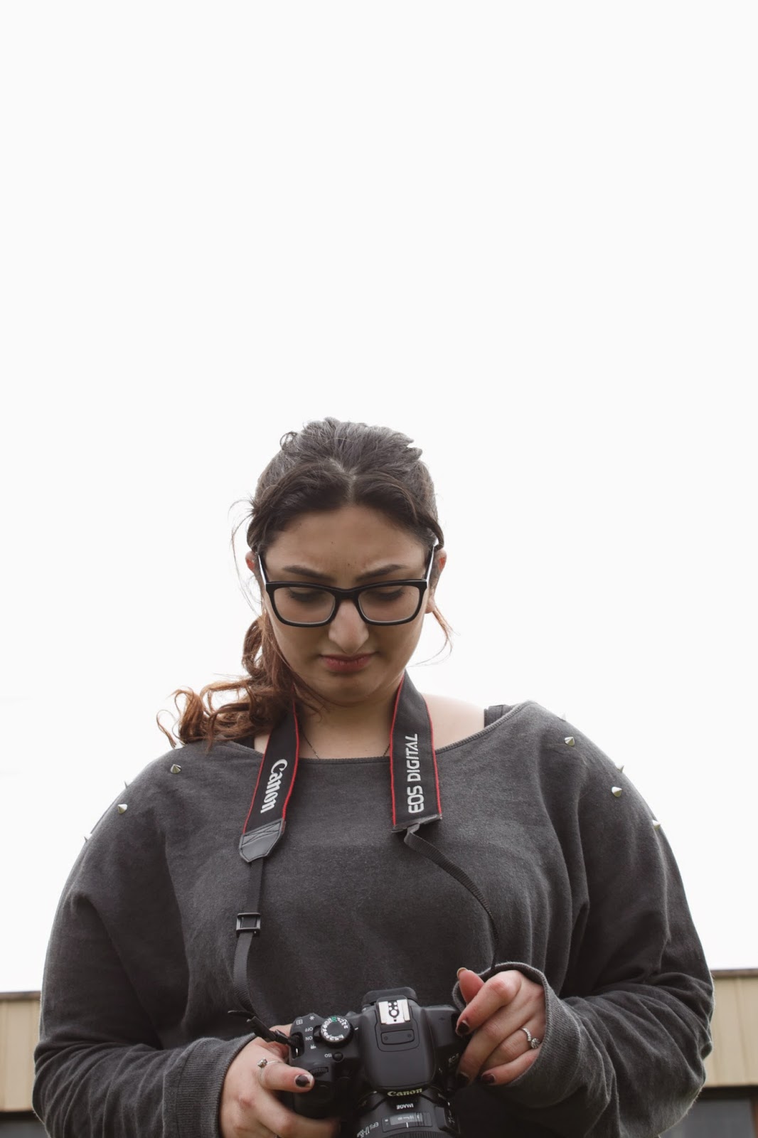
The sky in this image, while there wasn't any sun, was very bright which is why it looks as if the background is over exposed. The white is cloud, and the cloud makes the figure stand out. These low angle shots don't appear to be any different, but there is a small technical difference. The photograph on the left was shot in Centerweighted metering mode and the one on the right was shot in evaluative. There is one difference that i can see between these two images and that is the warmth in her skin, but that could be the angle of the photograph. To properly see the difference in the metering modes I'll probably have to reshoot the images on a sunny day and compare.

Friday, 22 August 2014

Research: Guy Bourdin. (WK 5)

Guy Bourdin received his first photographic training in Senegal in 1948/9 while undertaking military service. His photographs were first shown in Paris, 1952, and he began working for French Vogue in 1954. He was inspired by the surrealists. One of his biggest influences was Man Ray. Bourdin moved away from the roles of traditional photography, taking his own path instead.
When Bourdin uses colour in his photographs it is often bright warm colours, red frequents his photographs quite a lot. The warm colours in this photograph contrasts largely with the black of her outfit. Black and white are some other contrasting colours that frequent Bourdin's works.
Guy Bourdin, Charles Jourdan advertisement (1979)


Monday, 18 August 2014

Note: Focal length. (2) (WK 5)

Change in focal length as well as where I was standing:
Focal length- 18.0mm
Focal length- 24.0mm
Focal length- 55.0mm
Focal length- 34/5.0mm

 ISO 100
 F/8.0
 1/100
 For this exercise I moved around as I changed the focal length to try and keep the figure the same size
 in the frame each time i took the photograph.
 There is a lot more depth in the background of the
 top two photographs and this changes in the bottom two. The bottom two are more focused on her, but as I'm trying to keep her relatively the same size there is still some depth in the background. What I could see from this was that change in focal length as well as position is important in producing a good photograph. It was easy to stand in one spot and just take the picture, but moving around gave me a little more freedom within the frame.


Self Directed: Different Focal lengths.
ISO 100- F/4.5-1/60-35.0mm
ISO 100-F/4.0-1/60-18.0mm

ISO 100-F/5.6-1/60-55.0mm
These are just a few of the images I have done in my own time, each has a different focal length as was the aim of this activity, but they also incorporate other techniques as well, i.e vantage point, depth of field.