Tuesday 18 November 2014

Portfolio: Final Installation. (WK 8)


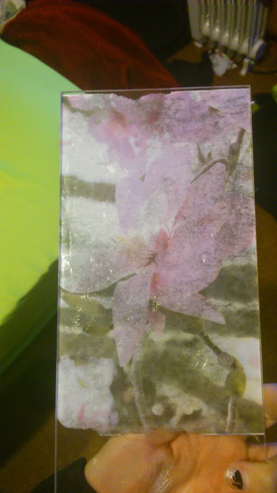
I really do love the outcome of my final installation. I think the photographs and the presentation works well together. I chose this format because of the two different orientations and because it was something a little different. I wanted the photographs to feel like equals, like no two photographs were competing with each other. I think the format works extremely well for the photographs. Had I had more than four photographs this wouldn't have worked. I like the close link between all of the photographs, there aren't two that go together, they all go together. I also really like the photographs sitting up off of the wall, I think it works better for the photographs. I am extremely happy with the way the photographs look as well, the faded almost dated look and the contrast between the more modern presentation and the older looking photographs, it worked so much better than I thought it would.

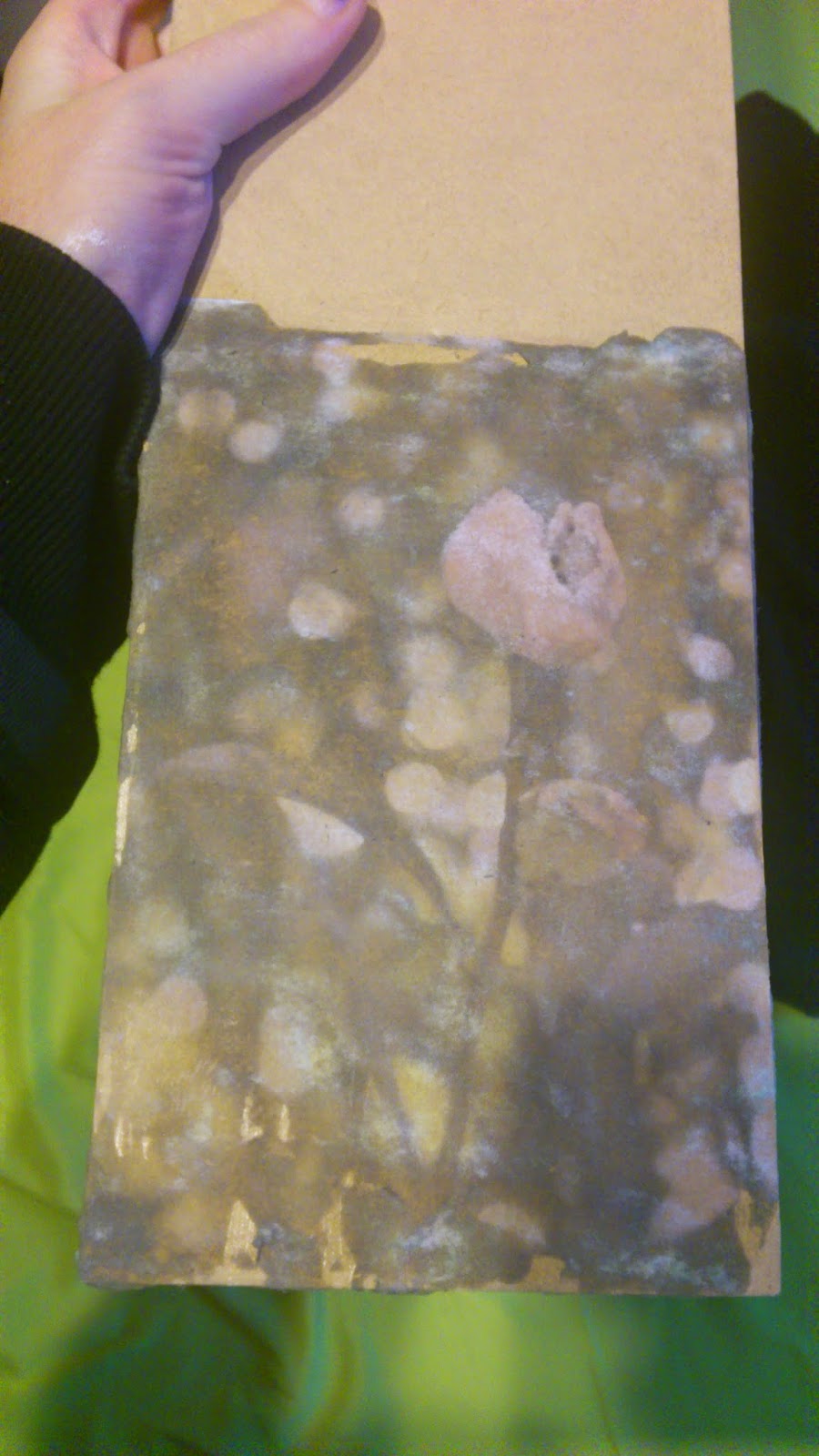
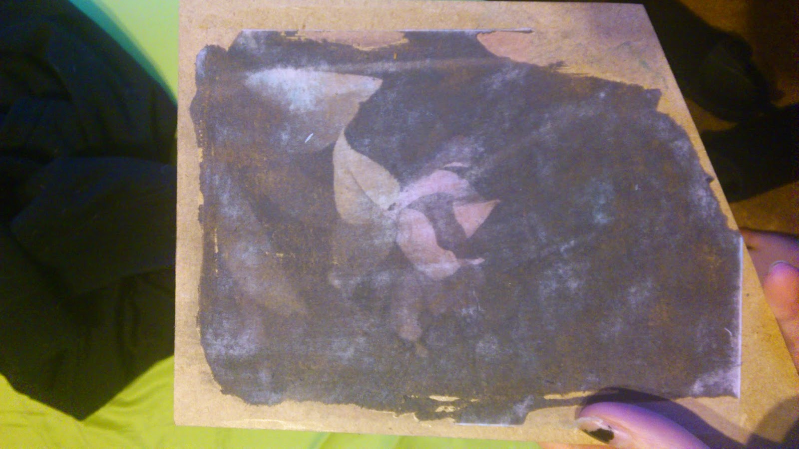
I was afraid that the sepia tone wasn't going to come out on the bottom image, the tone doesn't stand out as much as it does in the other three, but it is visible and it ties it all together even if it is a little softer. There were a lot of struggles in putting this project together. I had the problem where I couldn't get all of the paper off after the transfer, rubbing it too much and the ripping of the edges, which turned out okay. I used paint to cover the white paper and it worked to an extent, it wasn't completely invisible as I'd hoped, but it worked in making it less visible. I do kind of like the slightly scruffy look it has, it adds to the dated feel I was going for. I was careful when I re-transferred one of the images that I didn't rub too much or too little. I needed to get as much of the paper off as I could, while still being able to clearly see the detail in the photograph. When I accidentally ripped the edges, I was a little put out at first, until I saw the final result. I liked how the edges of the pictures weren't perfect, adding to that aged look as you wouldn't expect an aged photograph to be in perfect condition. All of these little mishaps in my experiment led to me finding new ways to better my photographs and the ways in which they were presented. It will be good for future reference if I ever decide to try a gel transfer again.

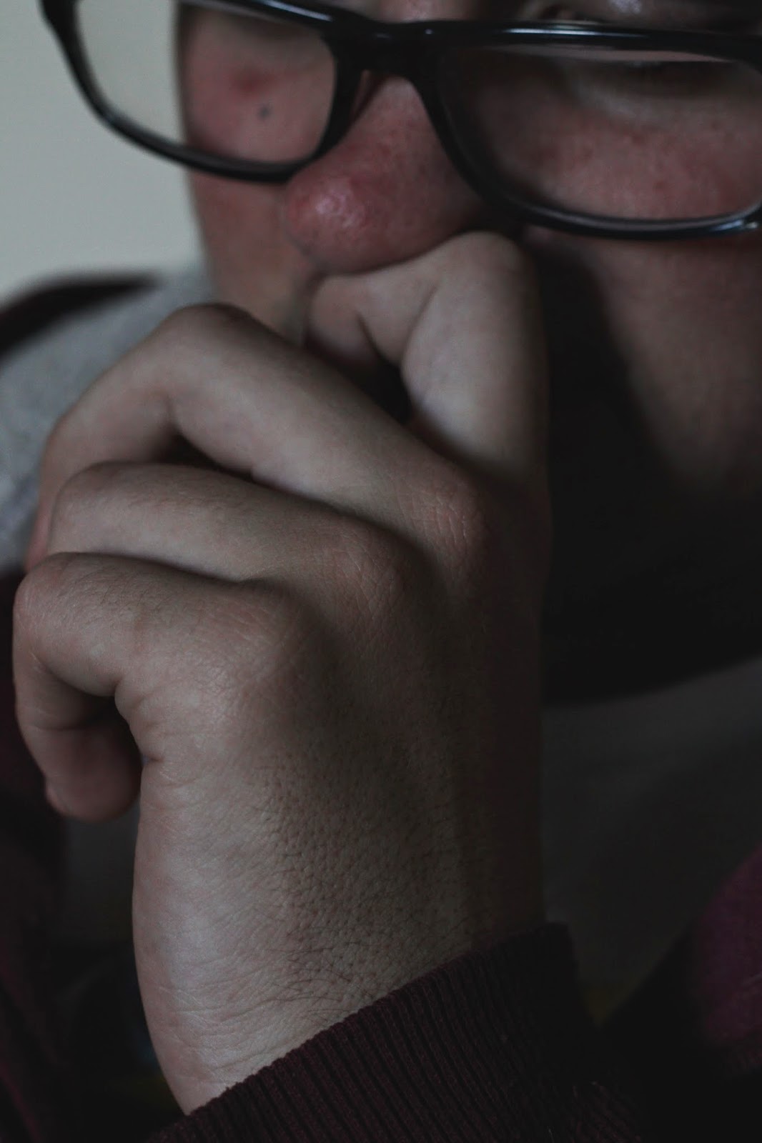
I think the more intimate feel I was hoping for has really come out in this series. The connection between the people in the images and the photographer is strong. The close up photographs work well to portray this feeling and it has a strong anonymous feel to it. The people in the photographs could be anyone and they could have no connection to each other or they could be as close as anything. The viewer is left with questions and that's how I wanted it to be, I wanted the photographs to cause a little conflict within the viewer, I wanted to them to stop and think about the photographs and their relationship to each other, to feel like they knew something about the person in the photograph while not knowing who they are.

All in all, I am really happy with the way the photographs came out. The presentation was an added bonus. I did numerous photo shoots to get the perfect photographs for my final installation and the photographs above were the top four out of all the photographs I took. I don't think there is anything I would've done differently in this case. The outcome was so much better than I could've hoped for and I really do love the gel transfer as a way to present photographs, it's something a little different and interesting.

Dt 2: Aaron K Visit.

Analysis of his website:

Aaron K's website is definitely one of the more user friendly sites out there. The layout of the page is both easy to decipher and to navigate. There are clear links to projects and portfolios that he has completed on the left hand side as well as scroll over images that will take you to a particular project/portfolio on the very front page. What I like most about his website is that everything is titled. The series all have a very creative name, such as disorderly conduct or hedge your bets. It is interesting to know, from his own mouth, that he comes up with many of the names of his collections as well, just because they liked how creative they were. When opening a link, the page is again extremely easy to navigate with clear arrows showing you that you can scroll through the images. I liked using his website, the different collections were easy to find and there were clear links to other forms of social media that he used.

Contextualisation of his work:

Aaron K's work is very staged and bold. His style of photography is very much in your face and out there and I love it. I like the bright colours and bold clothing. The lighting always accentuates the models and makes them stand out from the background. I love how there's always a little story in behind his works. Aaron K does a lot of editorial work, but there's always something more. They aren't just models wearing pretty clothes, there's actually a full story or an idea to go with it. His more conceptual photographs are definitely his stronger photographs, they're the ones that are memorable. He doesn't dance around subjects that are generally taboo, his series on eating disorders was beautifully crafted. The photographs held a lot of symbolism towards the subject, it was obvious as to what the idea behind the photographs was. The genre of his work is definitely creative with a fashion sub genre. But there is also a strong editorial aspect to his works as well, possibly along the lines of social documentary even if it is staged. I like the strong style of Aaron K's work and I would like to experiment in his style.

Monday 17 November 2014

Presentation Research: Gel Transfer.

Canvas:
http://www.pinterest.com/pin/457608012111691254/

My experience with printing onto canvas worked really well. I like the texture of the canvas as well as the softness it gives to the photographs. The faded, almost dated look was what I was trying to accomplish. I wanted the photographs to conflict, giving off an older feel, with some aspects of the modern world incorporated into them. The photographs look dated, with their black and white tones and an almost sepia aspect to them, the faded image and torn edges make them seem like they're from another time, yet the subject matter is that of a modern time. I like the way the canvas works with the photographs, and the white border gives it a gallery look to it. Also, having the photographs off the wall will make them stand out that little bit more.

Experimentation:
Initial experimentation with a coloured photograph, this experiment went well and paved the way to experiment with a larger scale as well as in black and white.


Wood:
http://www.pinterest.com/pin/334392341056472166/

As much as I like the pictures of wood transfers I looked at, it didn't work so well for me. Maybe it was the surface or maybe it just didn't like the colour photograph I'm not sure. It was hard to tell when all the paper was off and you were just left with the transfer, it was also a bit nerve-racking  getting the paper off to begin with, I was conscious of the fact that it wasn't a completely smooth surface and the chance of getting a splinter was likely. I was hoping the wood transfer would work better than what it did and I was disappointed when it didn't come out the way I had initially thought it would. My second trial was little better, there wasn't as much detail in the photographs as I would've liked, but it works, just not as well as I would've liked.

Experimentation:
This was my first experimentation with wood and as you can see the picture isn't as clear as I'd hoped it would be. The wood was a little rough so when I tried to take the paper off, I started rubbing the picture off as well.

The second time I attempted to transfer a photograph onto wood was much more successful, but while the detail is there, it isn't as detailed as I'd hoped it would be. I think with a clear coat over top the colour may come out a little more. The third one was mildly successful, there was little detail in the darker areas though, which is the area I needed the most detail in with my actual prints. I liked the wood, but I was conscious of how I'd hang it. With the canvas I could hide the pins, but with wood it would take a little more thought.


Glass and other surfaces:
http://www.alternativephotography.com/wp/processes/transfers-and-lifts/acrylic-gel-lift-and-transfer

The clear plastic surface didn't work so well for me. The paper was hard to get off and when I did, it looked as if too much had come off. I liked the idea of the clear plastic, it was light and thin and would've been something a little different. The colours were dull when I peeled the paper off and there were bubbles between the print and the surface. It would've been okay if there weren't any bubbles because the reverse side was clear and the colours came out really well. I chose to print bright photographs to see how much detail I could get in the lighter parts of the photograph because there was a lot of white in my photographs. After seeing the results of the transfer onto plastic I decided not to try and print it onto glass. I don't think it will be much different, I think it will come off just as easily. I might try it as a side project, but for this particular assignment I think I'll leave it be.

Experimentation:


Conclusion:

I liked the way the canvas looked the most. I don't know what it was, maybe it was the way it looked almost painterly or that it gave off a gallery feel with the white border. The white edges don't bother me so much, I think they give it a slightly scruffy feel which goes with the dated theme in the photograph, you would't expect older photographs to look brand new and I feel it goes well with the ripped edges in other parts of the image. Through trial and error I have decided that using the canvases was the best course of action. I spent a lot of time getting worked up over the small time frame that I had left. I like the canvases and the way they look, I don't particularly want to change them. None of the other surfaces gave me the same feeling that the canvases did, they didm't look as tidy or as well presented. The canvases are also the easiest ones to hang on the wall. The pins/nails will be invisible giving a cleaner look to them.

Portfolio Research: Amy Friend- Celestial Interventions.

Dare all Luce
I really loved Amy Friend's work with older found photographs. If I had more time, I would've liked to have experimented with light in a similar fashion, as it is I probably will revisit the idea when I have time. I love how much light is in the work and the different feel it gives the work just by adding in the spots of light. The idea came from the theory that to take a photograph of someone is to take their soul, but by piercing holes into the photographs, Amy Friend allowed light to pass through the photograph and bring life to the photographs.

 “In a literal and somewhat playful manner,” Friend says. “I aimed to give the photographs back to the light, hence the title of the series, Dare alla Luce, an Italian phrase used to describe the moment of birth.”

I really love this collection of images and the way the framing and light work together to bring the focus to one particular part of the image. Your eyes immediately go to the centre, to the subject matter the artist wants you to see. The dots remove a lot of the detail where there are more of them grouped up, but I think in this case it works quite well for the image. There's an almost anonymous feel to the photographs and I like that aspect of them. I like the framing that works to make this effect possible, the dots under the horses chin for example, the grouping brings your eyes to that part of the image and almost frames where the person and horse meet creating one line or the framing of the bodies in the second image and the way they're the light even surrounded by cloud, they still stand out instead of getting lost in the image. There's something almost otherworldly about the  images and that's why they stood out from other research I've done. Her work is so different and even if the photographs aren't hers, she put a new spin in terms of presentation. I'd love to do something like this with my canvases, but with so little time, there is no time for mistakes, I think I'll leave my experimentation where it is and try this another time.


Saturday 25 October 2014

Portfolio: Possible Final Installation Photographs


I have chosen four photographs for my final installation. I like these four the most out of the photographs I've taken. I have a few more to take, but I think I'll definitely use these four photographs. I'm aiming to add two more people to the installation, hopefully another male model just to help balance things out a little bit more.  What I like about these is the range in tone and colour. The lighting is similar for them, but there is one or two that are a little two bright. The first two, I probably like the lighting for the most. I also like the shadows across their skin and the small highlights in the glasses of the first picture. When I can, I'll adjust the lighting in the third image, to bring down the exposure and contrast a little to make it resemble some of the others. I don't mind it being a little brighter and I may have to adjust the first two to be a little brighter anyway so it should work out okay. I want to keep the editing to a minimum  to still give it a small documentary feel. 

I love the similar depths of field, the connection runs through all of them, which works really well. I wasn't sure I could obtain this feature, but it worked out quite well. I like the muted colours with the slight brightness in different areas. I love the framing, that's probably one of my favourite features. I looked at the framing a lot when photographing these ones, previously I had trouble with the framing and it was something I thought quite a lot about during these shoots. The focus on the hands works well which is what I wanted and spent most of the time looking at.


Wednesday 22 October 2014

Week 4: Sara Orme visit and Experimentation.

Contextualise:

What genre does their work fit into? What sub-genre?
-Editorial, documentary, retail.
-Creative, fashion, commercial.

What ideas are working within their photography?
-In terms of her personal ones, her connection with the people really works and helps create a better feel to the images. There is warmth in those images and a real bond between photographer and model. Working with distant relatives and documenting them growing up has worked well and it reflects well on her more society based images. Her personal projects show a lot of personality and they let her show more creativity. There are no set guidelines and she works well within her own style.
-In terms of her work based photography, they're fun, even when there are certain things she has to do within the photo shoot there's still that flair to her work. I love the running and movement. I like that she doesn't let the confines of what others want prevent her from producing such amazing images. I know that sometimes there isn't much she can do about what her clients want, but she makes it work by adding in little things, coming up with ideas on the scene and working with the environment around her rather than fighting it.

How do you as the viewer respond to the photographers images?
-They give me a little hope, the images are fun and bring a smile to my face. I do love how the models look like they're having a good time, they aren't restricted or being imposed on. It doesn't look as daunting of a task. I like her personally ones a little more than the commercial ones, if feel like there is more emotion there and more of a connection with the people.

Experimentation with movement:

ISO-100
F/8.0
1/320

Evaluation:

It was fun getting my model to move and run, probably not so much for him, he didn't want to run and complained the whole time. But it was an interesting experiment and certainly not as simple as I thought it was going to be. The timing had to be right and I wasn't so successful with that. The first photograph has captured him in motion, but I didn't get the framing quite right. In the other two I caught him moving away from me, both near and far and with the same foot up in the air. My shutter speed was quick and because of that I was able to freeze him in motion. I like photographing motion, I've had a little practice with cars at the track. I find it a little easier to frame it up correctly when you aren't so close to the figure so I think this was something that I needed to adjust for this experiment, as he ran past me he came close enough that it was hard to get all of him in the frame at one time. I think I'll have to practice a little more in capturing people in movement, it's not as easy as it looks but with the right camera settings it shouldn't be too difficult to focus on the framing and where I'm standing in terms of how close he'll have to be to come past me.

Tuesday 21 October 2014

Portfolio Research: Emmet Gowin.

Edith, Danville, Virginia, 1971. 10x8 inches.
Emmet Gowin is an American photographer that first gained attention in the 1970s. His photographs ranged from portraits of his wife, which is what started his interest in photography. I liked his portraiture photographs, the shadows and highlights. What I liked most was the close up of this image, even with the grain in the photograph there is still detail in her face. The grain means I can't see detail in her skin however, which is something I'm focusing on for my own photographs.

Ireland, 1972/1986. 8x10 inches.
The second image is an example of what I would like in terms of detail. I like that you can see all the lines and detail in the leaf. I also like the presentation, it works well for the image and I'm considering doing something similar for my own work. I like the vignette and the circular border. It reminds me of older photos done in a similar fashion with old frames. I think some of my photos may fit in with a similar style. It's a thought anyways, I wasn't sure how to present because they aren't exactly traditional photos, but I think this could be a way to mix traditional and contemporary to make the photos look a little more dated. I like the look of older photographs and for this I'll have all the perks of post production as well as sharp images, but in a style that appeals to me.