Sunday, 24 August 2014

Selections. (DT WK5)

After
Before
Before
For this exercise we focused on parts of the photographs taken. The photo to the left was originally a photograph with her eyes closed. Using a second photograph, I selected her eyes and merged it with this image. It took a bit of getting used to, using the clone tool as well as the burn tool, but I managed to get the skin tone around the eyes to look as if the image was taken as it is. It was a long process, but the result was better than I first expected it to be.

In the lower image to the right, the objective was to separate the figure and the background and then change the colour of said background. We were practicing using the magic wand tool/quick selection tool and for the most part, it did get the majority of the background, although there are patches right around the figure and in between the strands of her hair. If I had spent more time on this image-and I fully admit that I did not spend all that much time on it- I could have taken out all the yellow in the image, especially around her hair. It was a particularly difficult area, but with more time, I probably could have done a cleaner job.

The image to the left of this paragraph was relatively easy, using the lasso tool I selected an area of the image and changed the colour using hue and saturation. It was a simple task and relatively quick. I chose pink because of how well it goes with the yellow and how well it stands out in the image.

Note: Contrasting & Complimentary Colours. (WK 5)

ISO 100
F/8.0
1/100

ISO 100
F/8.0
1/100

ISO 100
F/8.0
1/100
Bright contrasting and complimentary colours:
ISO 100
F/8.0
1/100
The objective was to find contrasting and complimentary colours around Lovegrove crescent. I felt these four image showed the best of complimentary and contrasting colours. The yellow and pink work as well as the green and pink or the opposing green and reds. The combination of cool and warm colours, the brighter colours fighting for the viewers attention. The pink and green flower is probably my favourite image. The green leaf cuts through the pink. the pink trying to come forward in the image while the green of the leaf recedes more towards the back of the photograph.


 I personally like the non-cropped version of this image more, it feels more natural. This image looks a little squashed, but it does help to make the colours stand out a bit more and become the main focus of the image a little better. Before, it felt like the image was uncertain of what it was meant to be and the focus in general, but now it feels a little more focused on the colours of the two cars, which contrast beautifully.

Contrasting Colours and Light. (HW WK 5)

A photograph taken in early morning light with warm colours:
ISO 400
F/8.0
1/100
It's a little hard to see, but there's a ring on the lid that's a redish colour which is why I chose it. The warm colour was meant to contrast with the cool light, but instead looks washed out. Even though it wasn't as successful as I'd hoped it would, I still like this photo a lot.


The soft colours in these two photographs compliment each other quite well. The colours are designed to work together, something for a children's room. This is why the colours work well in complimenting each other.
 ISO 400
F/7.1
1/80

Take a photograph with complimentary colours:
The blue and pink (I couldn't find any red/violet) are colours that compliment each other quite well. The blue recedes while the slightly warmer, pink advances.
ISO 100
F/10
1/80


Take a photograph with contrasting colours in afternoon light:

It's a little hard to see, and maybe if I adjusted the exposure, but the little pods next to the flower are a green colour. Pink and green are colours that usually contrast quite well, the cooler green and the warmer/brighter pink. The afternoon light is quite harsh in this image as well, making the image slightly over exposed.


 Shoot a scene three times, using the correct white balance setting, and then using two incorrect white balance setting:
Daylight
Flash
Automatic White Balance
I took the same photograph four times with different white balances to look at the way the white balance could alter the light in the photo. For a few of them, it didn't seem to make a difference. For others it made a huge difference. The results are quite different, the flash and daylight settings were very similar with only a tint in one photograph making them different, but the tungsten setting made the most difference. As the light was a white fluorescent light, the tungsten setting cooled the whole image down making it blue. Had I used my usual room lighting, which is quite warm and yellow, the picture would have come out quite neutral rather than blue. This was an interesting experiment and showed the importance of using the correct white balance.
Tungsten


Saturday, 23 August 2014

Research: Rossella Vanon. (WK 5)

“The truth is the work of a photographer is much less technical than people probably imagine. There is no real rule in creating a fashion story, no rule in composition… Every photographer should have his own personal way of developing a story, of creating an image. It’s about observing and daring. And it’s always so personal and intimate.
70% of my work consists of imagining, creating and playing. You start from a technicality and you turn it around and you twist it and deform it, even, until you make it something unique. Until you make it yours.” – Rosella Vanon

Source:http://nw6creative.com/2013/01/28/there-is-no-real-rule-in-creating-a-fashion-story-rosella-vanon/
Light, it's a major aspect of Rossella Vanon's work. All different kinds of light, used in different ways. The light in the above photograph, seemingly natural is directed at the figure, bringing the attention of the viewer to the figure in the frame. The light is soft, highlighting parts of the figures face, bright enough that the viewer can see shapes and curves on her skin. Light helps accentuate parts of the photograph particularly in her face.

The studio light is directed at the model, seemingly from above, this allows the light to be trained on her face and shoulder rather than the rest of the image. I'm guessing a reflector was used to add some filler to the shadows that would've occurred on her face, primarily under her chin. The perks of this kind of lighting is it looks very natural, the (gold) reflector casts some warmth into her face making the image look as if it was taken outside.

Note: Colour, Metering mode & Focal length. (WK 5)

 Take a photograph of someone with their eyes closed and then with their eyes open:

The yellow background of these photographs really make the person stand out in the image. The dark colour of her hair makes a solid line between the background and the subject.


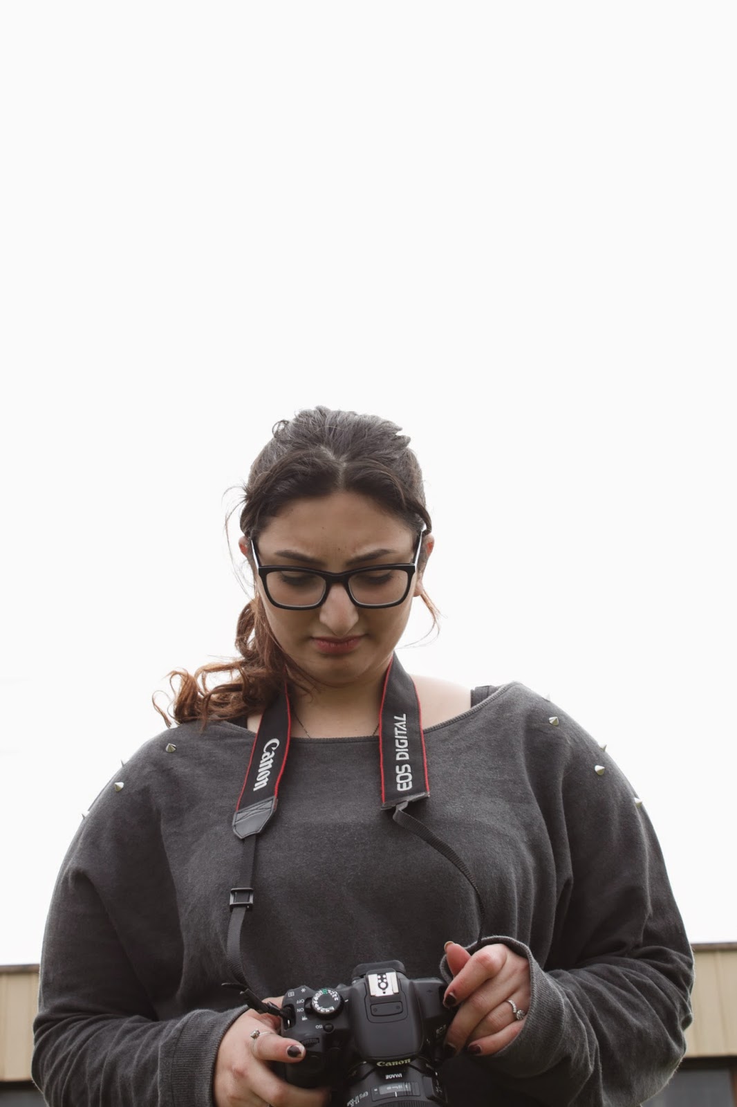
Take a low angle portrait of someone against the sky:

The sky in this image, while there wasn't any sun, was very bright which is why it looks as if the background is over exposed. The white is cloud, and the cloud makes the figure stand out. These low angle shots don't appear to be any different, but there is a small technical difference. The photograph on the left was shot in Centerweighted metering mode and the one on the right was shot in evaluative. There is one difference that i can see between these two images and that is the warmth in her skin, but that could be the angle of the photograph. To properly see the difference in the metering modes I'll probably have to reshoot the images on a sunny day and compare.

Friday, 22 August 2014

Research: Guy Bourdin. (WK 5)

Guy Bourdin received his first photographic training in Senegal in 1948/9 while undertaking military service. His photographs were first shown in Paris, 1952, and he began working for French Vogue in 1954. He was inspired by the surrealists. One of his biggest influences was Man Ray. Bourdin moved away from the roles of traditional photography, taking his own path instead.
When Bourdin uses colour in his photographs it is often bright warm colours, red frequents his photographs quite a lot. The warm colours in this photograph contrasts largely with the black of her outfit. Black and white are some other contrasting colours that frequent Bourdin's works.
Guy Bourdin, Charles Jourdan advertisement (1979)


Monday, 18 August 2014

Note: Focal length. (2) (WK 5)

Change in focal length as well as where I was standing:
Focal length- 18.0mm
Focal length- 24.0mm
Focal length- 55.0mm
Focal length- 34/5.0mm

 ISO 100
 F/8.0
 1/100
 For this exercise I moved around as I changed the focal length to try and keep the figure the same size
 in the frame each time i took the photograph.
 There is a lot more depth in the background of the
 top two photographs and this changes in the bottom two. The bottom two are more focused on her, but as I'm trying to keep her relatively the same size there is still some depth in the background. What I could see from this was that change in focal length as well as position is important in producing a good photograph. It was easy to stand in one spot and just take the picture, but moving around gave me a little more freedom within the frame.


Self Directed: Different Focal lengths.
ISO 100- F/4.5-1/60-35.0mm
ISO 100-F/4.0-1/60-18.0mm

ISO 100-F/5.6-1/60-55.0mm
These are just a few of the images I have done in my own time, each has a different focal length as was the aim of this activity, but they also incorporate other techniques as well, i.e vantage point, depth of field.