Monday, 18 August 2014

Note: Focal length. (1) (WK 5)

Change in focal length while standing in the same spot:

Focal length: 18.0mm
Focal length: 24.0mm
ISO 100
F/ 8.0
1/100

The change in focal length is a simple concept. I stood in the same spot for these four photographs and changed how much I zoomed in on the figure. You can see that with a smaller focal length I was more zoomed out and more of the person was in the frame, along with the background, but the more
 I zoomed in, the less of a background there was as
the figure filled more of the frame.

Focal length- 35.0mm
Focal length- 55.0mm


Monday, 11 August 2014

Photoshop: Layers + Layer masks. (WK 4)

 Layers are a useful photoshop tool and layer masks are equally as useful. Using different layers I was able to merge one photograph with another. This first image is an example of this, the two photographs have been placed one on top of the other and the opacity turned down so both are visible. It's simple enough, but the effect is very different. In the second image I used layer masks. The layer mask allowed me to do something similar as what I did to the first, but then allowed me to make only part of the second image visible. As you can see on the second image, the pattern that overlays the photograph, is only visible on his hands and face.

For this photograph I used basic editing in photoshop. The layers allowed me to see exactly what I'd done and possibly delete them if necessary. Editing a photograph in photoshop instead of camera raw made the changed I'd made immediately visible in the layers panel. This is somewhat better than camera raw in the sense that I don't try and do the same thing twice. All I did with this image was brighten it up a little, altering the levels, curves, vibrance and hue/saturation.

This image is another example of using layer masks. When I used the layer tool to make the image black and white it immediately created a layer mask. I was then able to erase the black and white area that I wanted to be in colour, in this case, his jacket. It is definitely a simpler way of adding some colour to a black and white photo and certainly a lot quicker than using the marquee tool and going around the entire section you want in colour.

Camera use: Texture/ Positive + Negative space. 'M' mode. (WK 4)


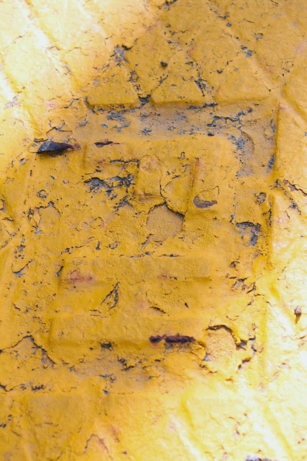
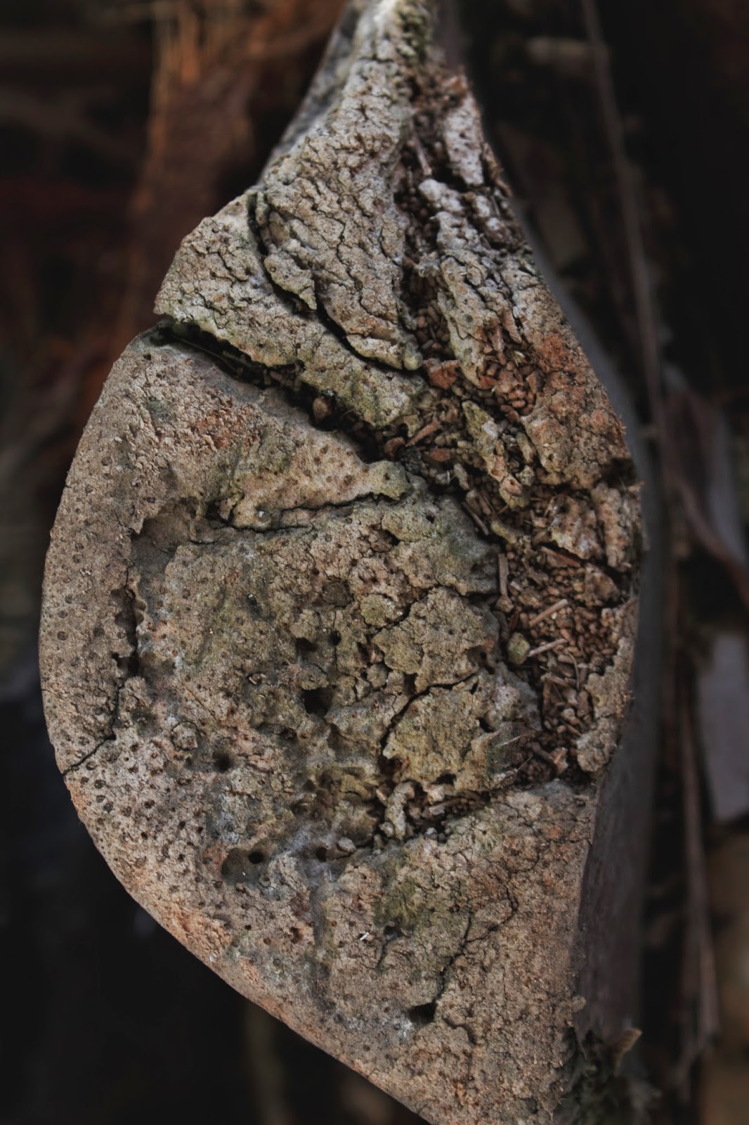
 These three photographs are different example of texture found outside. The photos themselves are nothing special, but seeing the different textures immediately brings to mind what the subject matter would feel like.


ISO 100
F/ 8.0
1/100

Positive space= the subject in the frame.
Negative space= the space between and around the objects.

 This photograph is a simple example of positive and negative space. The positive space is the power poll and lines, while the negative is the sky behind it. The lack of detail int he sky means the negative space holds no detail and doesn't distract from the subject matter.

ISO 100
F/ 8.0
1/100


Self directed:


Positive & Negative space-
Inspiration struck with this very basic example of positive and negative space. I think I need a little more practice where fire is concerned, a faster shutter speed would've made a huge difference, but shutter wasn't exactly what I was focused on, I wanted to try and get the pattern in the glass of the oil burner and if I'd managed to get the fire completely still it would've been a great image. A reshoot may be in order if I want to show the texture of the flame as well as the pattern on the glass.

Research: Hiroshi Sugimoto. (WK 4)

"For a long time it was my job to stand on cliffs and gaze at the sea, the horizon where it touches the sky. The horizon is not a straight line, but a segment of a great arc. One day, standing atop a lone island peak in a remote sea, the horizon encompassing my entire field of vision, for a moment I was floating in the centre
of a vast basin. But then, as I viewed the horizon encircle me, I had a distinct sensation of the earth as a watery globe, a clear vision of the horizon not as an endless expanse but the edge of an oceanic sphere." -Hiroshi Sugimoto.


Hiroshi Sugimoto uses line as the basis for these two artworks. The photographer took a different approach to photographing the horizon, with the photographs presented side on. There is a distinct line between the sea and sky in both images and at first, I wasn't sure what I was looking at. Not having read the titles I first looked at the images and figured they were part of a piece of architecture, but after reading the titles it became clear what the artist was trying to portray. The contrast between the lighter colour and the dark is amazing, creating the distinct horizon line in the photographs. His photographs have a lot of impact in black and white and for that's one of the reasons I chose to look at his works. The lack of colour helps create less noise in the artwork, the silence almost jumps out to the viewer.

These two images are great examples of positive and negative space, more on the negative space side than anything. The sun and white created by it would be considered the positive space, while the negative is the space around it. The flatness of this image makes it easy to distinguish the two.

Note: Framing and Composition. (WK 3)

Notes:

When framing a scene:
-Slow down
-Move around
-Change angles
-Get closer/further away
-Ask subject to shift
-Relocate moveable objects
-Focus and depth of field decisions


Metering Modes-
Evaluative- All-round metering mode, suited for portraits and back-lit objects. Exposure is set automatically. Good for light that's even across the entire photograph.
Partial- Effective when the background is much brighter that the subject due to back-lighting. Covers about 9% of the view finder area at the center.
Center-weighted average- The metering is weighted at the center and then averaged for the entire scene.

Patterns:
-Try filling the frame
-Experiment with angles
-Consider negative space
-Consider breaking the pattern

Manual Mode Practice. (WK 3)

Close crop portrait:
ISO 100. F/8.0. 1/100


Portrait + a wider background:
ISO 100. F/8.0. 1/100


The rule of thirds practice:

ISO 100. F/6.3. 1/60

Bernd and Hilla Becher inspired photo:

ISO 100. F/25.0. 1/100
Patterns:

ISO 100. F/8.0. 1/100

ISO 100. F/8.0. 1/100
Manual or 'm' mode provides the most freedom when taking photographs. Practicing with 'm' mode was both frustrating and rewarding at the same time. Using 'm' mode isn't always easy and I've gained some insight to how to use my camera from just toying around with it and taking spur of the moment photos. Each of the techniques above weren't overly hard to achieve, but it was finding the right settings that put me off for a while. I had some bad luck with over and under exposure and it did put a damper on things, but the photographs that resulted from me learning from my mistakes were better than I could've hoped for.

Compositional techniques:
-Image 1: I wanted him to fill the frame, I wanted to show the way he was leaning, but to have the focus on his face. I also wanted to show part of the tree to help seperate the almost solid white of the sky. The triangle the way his arm is positioned.
-Image 2: I wanted to show a wider angled shot of him and the white dog, however the two dogs were racing in and out of the frame making it hard to get one next to him. I wanted to show the contrast between the colour of her white fur and his jersey. The tree was also another part I looked at, I wanted it to be central with the two figures in front of it. The way the black dog is angled makes the photograph kind of awkward.
-Image 3: The rule of thirds practice, it was easy to use these little flowers and position them on one of the rule of thirds lines, the yellow colour stands out from the background as well, making it easier to see what I was trying to accomplish.
-Image 4: The Bernd and Hilla Becher inspired photo. There were some specifics that I wanted to include in this image when I took my impatation photo.
 * No people.
 * Isolating of the structure.
 * Flat light.
 * Central subject.
 * Straight on vantage point.
 * Central vantage point.

Wednesday, 6 August 2014

Camera Raw: Sharpen/Correct. (WK 3)

After
Before
With this photo I had a lot of correcting to do. The photograph was over exposed and from there I had to darken it and bring out the colours a bit more. I used the sharpen tool to make the lines within the image a little more prominent, especially the lines of the path. I'm not sure i like how the sky turned out, the grey in the top corner annoys me a little, but to take that out I'd have to tone down the blacks and shadows and I like the way the shadows are for the rest of the image. The trees were tinted a little pink so I had to adjust that and in turn bring out the greens in the image a little more than before, but the colour isn't overbearing.

 Ways I could remove the grey from the top corner: crop the image, or I could go back and adjust the exposure and white balance in camera raw.


In the left photograph, I adjusted the exposure and used the whites slider to reduce the amount of grey in the corner, it did however start to become overbearing and looked just as over exposed as the original image. In the right picture, i simply cropped the image, removing the grey area entirely. I don't know which i like more, the cropped image feels as if I'm closer to him and there's less noise, but the non-cropped one looks better in terms of depth.