I really loved the gallery visit. Seeing all those works up where the pubic can see, it gives me chills and if I ever have my work up next to the likes of Mark Adams it'll be an amazing day. Seeing such beautiful photographs, put together in such a way that they were all linked even if they had such different subject matter was astounding. Being able to see all of that really put into perspective the way in which some photographs should be presented. I understand a little better the differences in presentation and how they can alter the portrayal of the photograph.
Questions:
1) Does the look of these works differ to each other in terms of sharpness and grain, and if so, do these differences affect the viewing of these works?
- They all differ in sharpness and resolution, some, such as Mark Adams work is much sharper than that of Akura Makea-Pardington. But this is not a drawback for the works, Akura's work for example suits having a softer resolution, especially with some of the story behind it. The softness of some of the works, works well for them, just as the sharpness works for others.
2) Choose a work and analyse it in terms of compositional techniques and the ideas you think the photographer is working with:
- I chose Mark Adams work Savaii, Samoa 2008. Compositionally, the structure in the work is the main focus, with the forest around encroaching in on the building. The walls of the image are very straight within the frame, as if he's standing inside the building and lined up the edges of the frame with the walls of the structure. There is a contrast between light and dark in the upper and lower frame, the forest around providing this vibrant green, trying to overcome this dark hardened lava floor. The remains of human life are once again becoming one with the earth and I think that's astounding, it's as if the forest is trying to heal the destruction caused by natural forces. The whole image is hauntingly beautiful and I'm not sure, but I think that's what the photographer was going for.
3) Comment on the framing, size and presentation. How does the framing and presentation change your perception of the work compared to when you saw it on your computer screen?
- The computer screen really didn't do the image justice. With the size of the work, you can see all the little details in the cracks and the writing on the walls of the structure. The frame works well for the image, the black frame ties with the darkness of the image itself. I think a white frame would've detracted from the image as it would've stood out a lot more, but the black frame almost molds with the image. The only problem I had was the glass, because of the reflective surface, it was hard to see detail in the darker areas.
4) Is there anything you would do differently in the presentation of this photograph?
- I think using a different glass would've worked better for this image, the glass distracts the viewer because it's reflective, but the frame works well with it. So, cost wise, a black canvas probably would have done well for this image. I am conscious that the curator wanted to protect the image from the elements and every day life, so a frame was probably necessary. It's a bit of a balancing act.
Saturday, 6 September 2014

Research: Lighting Diagram. (WK 7)
Lighting Diagrams
The above link leads you to a page with a lot of different lighting diagrams and examples. I found it helpful, especially in some different situations. The diagrams are simplistic, and with the examples they're easy to understand.
 I also found the above image (through a google search) which was helpful in showing an example of how a professional would shoot a model in the studio. I like how the author of the image added in what his/her camera details were as well.
Lighting- Here is a link to the rest of the page, there are examples and diagrams for different kind of lighting situations.
The above link leads you to a page with a lot of different lighting diagrams and examples. I found it helpful, especially in some different situations. The diagrams are simplistic, and with the examples they're easy to understand.
Lighting- Here is a link to the rest of the page, there are examples and diagrams for different kind of lighting situations.
Studio: Filters and Gels. (WK 7)
Filters:
-U.V filters, protect the lens of the camera. Does not effect the colour of the photograph.
-Polarising filters, cuts the reflection in an image.
-Red filters, for black and white photography, creates contrast.
Studio Gels: Are a simple way of changing the light in the studio. The gels go over the light to alter the colour in the studio rather than in post production. Can also be used to colour the background and/or to change the colour of the light on the person.
Gel on the background-
Gel on the person-
Gel on both the background and person-
The above are three examples of gels used in the studio. They are all very different because of the difference in lighting situations. The lighting adds and retracts depth from the image, the final image has a lot more depth than what the first two do. This could be because of the colour choice as well the purple is quite deep all on it's own. The orange and blue added very little to the images, the lights had been turned down quite a bit to actually see the colour on the background at all. The light on the figure looks a little gimicky so it's probably not one I would use in a serious situation. The different colours also add different feels to the image, some of them look more child-like, such as the green, but I guess in the right circumstance it wouldn't look silly at all. I'm not sure if I'll use gels in the future, maybe for a fairytale-like scene.
-U.V filters, protect the lens of the camera. Does not effect the colour of the photograph.
-Polarising filters, cuts the reflection in an image.
-Red filters, for black and white photography, creates contrast.
Studio Gels: Are a simple way of changing the light in the studio. The gels go over the light to alter the colour in the studio rather than in post production. Can also be used to colour the background and/or to change the colour of the light on the person.
Gel on the background-
 |
| ISO 100-F/11.0-1/80 |
Gel on the person-
 |
| ISO 100-F/5.6-1/80 |
Gel on both the background and person-
 |
| ISO 100-F/8.0-1/80 |
The above are three examples of gels used in the studio. They are all very different because of the difference in lighting situations. The lighting adds and retracts depth from the image, the final image has a lot more depth than what the first two do. This could be because of the colour choice as well the purple is quite deep all on it's own. The orange and blue added very little to the images, the lights had been turned down quite a bit to actually see the colour on the background at all. The light on the figure looks a little gimicky so it's probably not one I would use in a serious situation. The different colours also add different feels to the image, some of them look more child-like, such as the green, but I guess in the right circumstance it wouldn't look silly at all. I'm not sure if I'll use gels in the future, maybe for a fairytale-like scene.
Friday, 5 September 2014
Research: Photographing Children.
Polish artist photographing her children
The link above sends you to a website called Artfido. The website has all kinds of artistic approaches and I just happened to find one that sent me to a page with some really beautiful photography of children. The photographs are simplistic, black and white, with children going about their daily things. Having the children in their natural environment has made these images even better. As the children are her own, they would have been a lot more comfortable with her, there's no awkwardness, just kids being kids. Photographing children isn't always the easiest, but the above artist has done remarkably well. Her use of framing and shutter are what I like the most. She's managed to capture the motion of the children as they go about their activities, and kept them frozen in time. Framing is a big part of some of her photographs, especially the one where one of the boys is looking through some kind of leafy plant. His eyes are perfectly in focus, framed by the leaves around him.
Her use of black and white simplifies the noise in the image, there is a lot of depth in the shadows and nothing in the background to distract the viewer. The narrow aperture of her close up images also helps to reduce background noise. It stops little things from standing out too much and creating too much for the viewer to get distracted by. The photographs with slightly larger apertures feel a lot wider, as if there is more space in the image, this could be something she thought a lot about before hand, the way she wanted the image to be portrayed as the narrow/wide depth of field does change how it is portrayed quite drastically.
The link above sends you to a website called Artfido. The website has all kinds of artistic approaches and I just happened to find one that sent me to a page with some really beautiful photography of children. The photographs are simplistic, black and white, with children going about their daily things. Having the children in their natural environment has made these images even better. As the children are her own, they would have been a lot more comfortable with her, there's no awkwardness, just kids being kids. Photographing children isn't always the easiest, but the above artist has done remarkably well. Her use of framing and shutter are what I like the most. She's managed to capture the motion of the children as they go about their activities, and kept them frozen in time. Framing is a big part of some of her photographs, especially the one where one of the boys is looking through some kind of leafy plant. His eyes are perfectly in focus, framed by the leaves around him.
Her use of black and white simplifies the noise in the image, there is a lot of depth in the shadows and nothing in the background to distract the viewer. The narrow aperture of her close up images also helps to reduce background noise. It stops little things from standing out too much and creating too much for the viewer to get distracted by. The photographs with slightly larger apertures feel a lot wider, as if there is more space in the image, this could be something she thought a lot about before hand, the way she wanted the image to be portrayed as the narrow/wide depth of field does change how it is portrayed quite drastically.
Monday, 1 September 2014
Camera Practice: Imitation. (Self Directed)


On the left is the image I found when researching male model poses. I've had a lot more difficulty finding poses for men than what I did for women, so this practice task was both fun and informative. I took quite a few photos that were based loosely on the ideas I found on pinterest. My photograph is a lot darker than the one of the left, I could use camera raw to adjust the exposure in the photograph to match something similar to the other picture. My light direction and position are also slightly different. I suspect that for the left hand picture, the photographer was below their subject, either leaning down, kneeling or on a lower step. Either way this vantage point is something that differs from my image.

 Besides the obvious difference in these two photographs, the lack of rain/puddles and therefore the lack of the sky reflecting off of the ground, I think my imitation was pretty close. What I needed was to get a little closer to the subject, to allow him to mostly fill the frame. Because of the weather, the colours are a lot different as well, whereas in the first image there is a lot of cool colours, mine are quite neutral due to the overcast day. His clothes wouldn't have helped with this colour contrast either. had he worn hues such as the figure in the example photograph, the tone of the photograph would have been altered slightly as well. I know what I can do to improve my image, but as this was a practice to see what I could do when I used others images as inspiration I probably will not reshoot this image.
Note: Lighting. (WK 6)
We looked at the three point lighting system, but what we also looked at was different ways to use those lights. One of the harsher ones, that we originally used as a back light, we also used to create a halo around the model as well as some other cool things...


I like the last two images, the use of positive and negative space is well balanced. The shadows across their faces, showing detail in the light, it worked really well and it's definitely a technique that I'll remember.
ISO 100
F/8
1/80
I like the last two images, the use of positive and negative space is well balanced. The shadows across their faces, showing detail in the light, it worked really well and it's definitely a technique that I'll remember.
ISO 100
F/8
1/80
Note: Studio lighting-Three point lighting. (WK 6)
This session was actually really interesting, I'd had a little experience with working in a studio, but nothing so complex as what we did. Three point lighting is a basic, yet efficient lighting situation. While we were in the studio, we looked at how lighting affected the subject matter and different ways we could use lighting. The three point lighting system is pretty basic and easy to understand, there are three light, the key light, the fill light and the back light.
The key light- The key light is the main light in a shoot, it's the harshest/brightest/strongest light. The key light is generally trained on the face of the model (as it is below).
The fill light- (2 stops less than the key) This light fills in the shadows created by the key light. It prevents the shadows from getting too dark. (In the photos below the fill light is trained on the right side of his face.) The fill light is not as bright as the key light.
The back light- (Slightly brighter than the key light.) The back light seperates the subject from the background. It provides definition and highlights. This kind of light is good for illuminating the models hair.
Examples-
The key light- The key light is the main light in a shoot, it's the harshest/brightest/strongest light. The key light is generally trained on the face of the model (as it is below).
The fill light- (2 stops less than the key) This light fills in the shadows created by the key light. It prevents the shadows from getting too dark. (In the photos below the fill light is trained on the right side of his face.) The fill light is not as bright as the key light.
The back light- (Slightly brighter than the key light.) The back light seperates the subject from the background. It provides definition and highlights. This kind of light is good for illuminating the models hair.
Examples-
 |
| ISO 100 F/14 1/80 Key light and fill light |
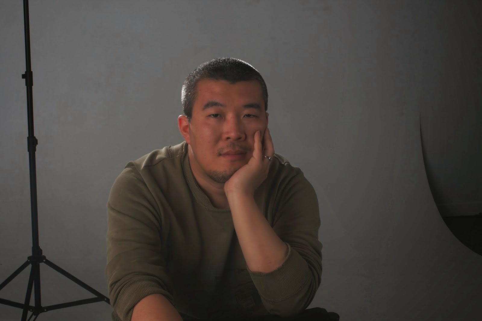 |
| ISO 100 F/20 1/80 Key light, back light and fill light. |
 |
| ISO 100 F/20 1/80 Key light and Back light |
 |
| ISO 100 F/20 1/80 Back light only |
Subscribe to:
Posts (Atom)